A statistical review of ‘Thinking, Fast and Slow’ by Daniel Kahneman
I failed to find Kahneman’s book in the economics section of the bookshop, so I had to ask where it was. “Oh, that’s in the psychology section.” It should have also been in the statistics section.
He states that his collaboration with Amos Tversky started with the question: Are humans good intuitive statisticians?
The wrong brain
The answer is “no“.
We are good intuitive grammarians — even quite small children intuit language rules. We can see that from mistakes. For example: “I maked it” rather than the irregular “I made it”.
In contrast those of us who have training and decades of experience in statistics often get statistical problems wrong initially.
Why should there be such a difference?
Our brains evolved for survival. We have a mind that is exquisitely tuned for finding things to eat and for avoiding being eaten. It is a horrible instrument for finding truth. If we want to get to the truth, we shouldn’t start from here.
A remarkable aspect of your mental life is that you are rarely stumped. … you often have answers to questions that you do not completely understand, relying on evidence that you can neither explain nor defend.
Two systems
A goodly portion of the book is spent talking about two systems in our thinking:
- System 1 is effortless, fast, completely heuristic, and unconscious
- System 2 takes work, is slow, and sometimes uses logic
Kahneman is careful to note that this division is merely a model and not to be taken literally. There are not sections of the brain with System 1 or System 2 stamped on them.
We started with the question of statistical intuition. Intuition implies System 1. Statistics implies counterfactuals — things that might have happened but didn’t. System 1 never ever does counterfactuals.
System 1 will attribute significance that isn’t there. That’s survival: seeing a tiger that isn’t there is at most embarrassing; not seeing a tiger that is there is the end of your evolutionary branch. Our intuition is anti-statistical — it doesn’t recognize chance at all, and assigns meaning to things that are due to chance.
One of the chapters is called ‘A machine for jumping to conclusions’.
Regression
The chapter on regression is the best explanation of the phenomenon that I know. Chapter 17 ‘Regression to the Mean’ should be supplementary reading for every introductory statistics class.
Piecharts
Pie is for eating, not for charting.
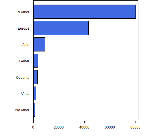
One of our System 1 modules is comparing lengths. (Brain Rules describes the fantastically complicated mechanism of our vision.) Understanding lengths is effortless and almost instantaneous. Understanding angles and areas (and volumes) is not automatic — we need System 2 for those.
Figure 1: A piechart. 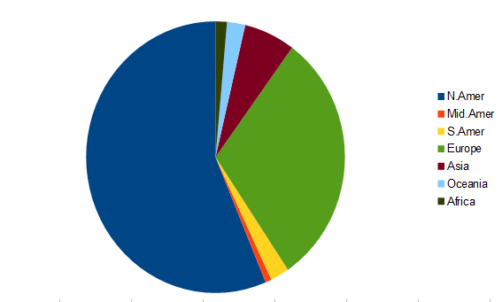
Figure 2 presents even more information in a different format.
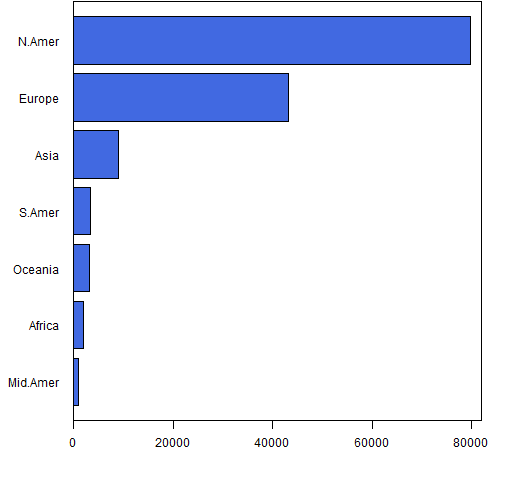
It takes a non-trivial portion of a minute to get the information from the piechart — information that you get in a fraction of a second from the barplot. And the barplot encodes the information so you can easily recover it.
Bayesian reasoning
Your probability that it will rain tomorrow is your subjective degree of belief, but you should not let yourself believe whatever comes to mind. … The essential keys to disciplined Bayesian reasoning can be simply summarized:
- Anchor your judgement of the probability of an outcome on a plausible base rate.
- Question the diagnosticity of your evidence
Both ideas are straightforward. It came as a shock to me when I realized that I was never taught how to implement them, and that even now I find it unnatural to do so.
Decision weights
It should be no surprise by now that the propensity of people to accept gambles doesn’t map into the actual probabilities. Figure 3 shows values that were found via experiment.
Figure 3: Decision weights versus probability. 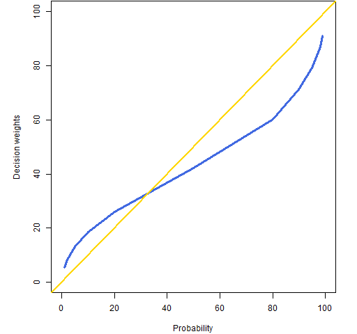
There are two things to notice about Figure 3:
- there is definite bias in the decision weights
- the decision weights don’t go to 0 and 100%
The decision weights at 0 and 100% do correspond to the probabilities, but things get complicated for rare events.
It is hard to assign a unique decision weight to very rare events, because they are sometimes ignored altogether, effectively assigning a decision weight of zero. On the other hand, if you do not ignore the very rare events, you will certainly overweight them. … people are almost completely insensitive to variations of risk among small probabilities. A cancer risk of 0.001% is not easily distinguished from a risk of 0.00001%
Figure 4 shows what Kahneman calls the fourfold pattern: how do we act when facing gains or losses with either high or low probability?
Figure 4: The fourfold pattern. 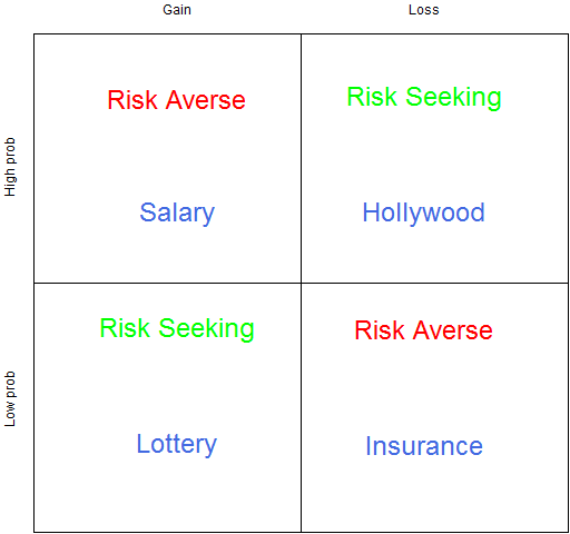
We are most used to thinking about the low probability items. Faced with a low probability of a gain, people buy lottery tickets. Faced with a low probability of a loss, we buy insurance.
We are risk averse when we have a high probability of a gain — we would rather accept a slightly low salary than risk not getting (or continuing) a job.
The top right is what I find most interesting (as does Kahneman). This is the basis of a whole lot of Hollywood movies. When there are no good options, go for broke. If you are being chased by three sets of bad guys, then jump the river in your car.
Our nonlinear attitude towards risk (see the Portfolio Probe review for more on this) means that we are subject to being overly risk averse. We can reject gambles that have a positive expected payoff. That’s okay if there really is only one gamble. But if there is a whole series of gambles, then we need to try to look at the whole set of gambles rather than look at each one in sequence.
Theory-induced blindness
A phrase I love, and that should be used a lot more.
Amos and I stumbled on the central flaw of Bernoulli’s theory by a lucky combination of skill and ignorance. … We soon knew that we had overcome a serious case of theory-induced blindness, because the idea we had rejected now seemed not only false but absurd.
Experiencing and remembering selves
We divide ourselves not only along the lines of System 1 and System 2, but between our experiencing selves and our remembering selves. One would hope that our remembering selves would treat our experiencing selves right. But once again our hopes are dashed — experimenters can get people to do very illogical things by manipulating our weaknesses regarding memory.
Yet more statistical issues
Chapter 21 talks about the case of simple formulas outperforming in-depth analyses by humans. For example, trained counselors predicting students’ grades after a 45 minute interview with each didn’t do as well as a very simple calculation.
The law of small numbers is about failing to take variability into account when sample sizes differ. Are small schools better? Yes. Are small schools worse? Yes.
The illusion of understanding is reading too much into history. This is the central topic of Everything is Obvious.
Video
This video uses the idea of the US grade point average (GPA). For those not familiar with it, the top score is 4.0 — a value that is rarely obtained.
Appendix R
The graphics were done in R.
piecharts
The piechart (Figure 1) was done in an OpenOffice spreadsheet. R will do piecharts, however it makes it hard to separate the labels from the slices as is done with the legend in Figure 1 (but of course it is possible to do in R). The R help file also points to research about perception.
barplot
The R function that created Figure 2 is:
function (filename = "phonebar.png")
 {
    if(length(filename)) {
    png(file=filename, width=512)
    par(mar=c(4,5, 0, 2) + .1)
    }
    barplot(sort(drop(tail(WorldPhones, 1))), horiz=TRUE,
       col="royalblue", las=1, xlim=c(0, 82000))
    box()

    if(length(filename)) {
       dev.off()
    }
 }
dotcharts
An easier way of getting essentially the same thing as the barchart is:
dotchart(sort(drop(tail(WorldPhones, 1))))
This produces Figure A1.
Figure A1: A sorted dotchart. 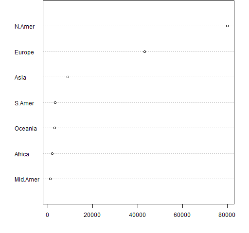
The dotchart function is more talented than that. Figure A2 was created with:
dotchart(tail(WorldPhones, 3))
Figure A2: A multiperiod dotcchart. 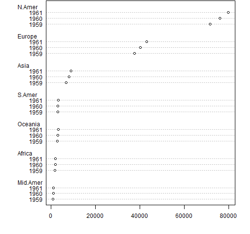
decision weights
The function that created Figure 3 is:
function (filename = "decisionwt.png")
{
    if(length(filename)) {
       png(file=filename, width=512)
       par(mar=c(4,5, 0, 2) + .1)
    }
    probs <- c(1,2,5,10,20,50,80,90,95,98,99)
    dwt <- c(5.5, 8.1, 13.2, 18.6, 26.1, 42.1, 60.1,
       71.2, 79.3, 87.1, 91.2)
    plot(probs, dwt, xlim=c(0,100), ylim=c(0,100), type="l",
       lwd=3, col="royalblue", xlab="Probability",
       ylab="Decision weights")
    abline(0, 1, col="gold", lwd=2)

    if(length(filename)) {
       dev.off()
    }
}
fourfold pattern
Figure 4 was created with:
function (filename = "fourfold.png")
{
    if(length(filename)) {
       png(file=filename, width=512)
       par(mar=c(0,2,2, 0) + .1)
    }
    plot(0, 0, type="n", xlim=c(-1,1), ylim=c(-1,1),
       xlab="", ylab="", axes=FALSE)
    axis(2, at=c(-.5, .5), tck=0, labels=c("Low prob", "High prob"))
    axis(3, at=c(-.5, .5), tck=0, labels=c("Gain", "Loss"))
    box()
    abline(h=0, v=0)
    text(-.5, .8, adj=.5, "Risk Averse", col="red", cex=2)
    text(.5, -.2, adj=.5, "Risk Averse", col="red", cex=2)
    text(-.5, -.2, adj=.5, "Risk Seeking", col="green", cex=2)
    text(.5, .8, adj=.5, "Risk Seeking", col="green", cex=2)

    text(-.5, .3, adj=.5, "Salary", col="royalblue", cex=2)
    text(-.5, -.7, adj=.5, "Lottery", col="royalblue", cex=2)
    text(.5, .3, adj=.5, "Hollywood", col="royalblue", cex=2)
    text(.5, -.7, adj=.5, "Insurance", col="royalblue", cex=2)

    if(length(filename)) {
       dev.off()
    }
}
Updates
Here is a pictorial response to the question from Alan T. The question is essentially: it seems impossible for the IQ of the husband of a bright woman to be below hers while at the same time the IQ of the wife of a bright husband is below his. How is this possible?
Our lack of statistical intuition shines through here, but a picture makes it clear that it actually works that way.
Figure U1: Pretend data of IQ of husbands and wives. 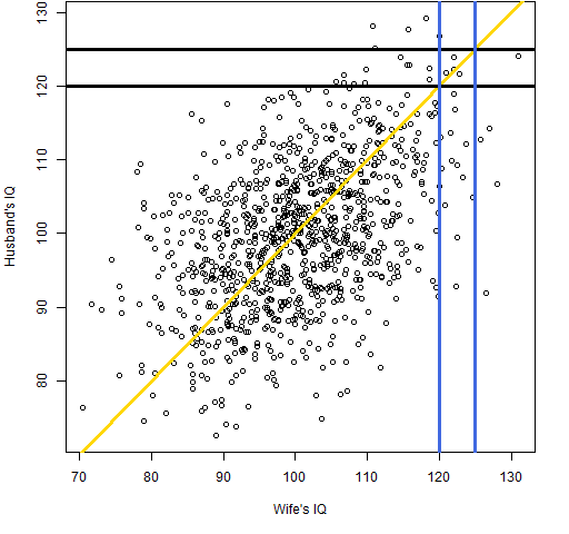
The gold line is the equal IQ line. The blue lines show the values of wives’ IQs between 120 and 125, and the black lines show the values of husbands’ IQs between 120 and 125. Clearly a woman with an IQ of about 120 is very likely to be married to someone with a lower IQ. And the same is true of a man.
The R code to create this was:
require(MASS)
iqcor <- matrix(.5, nrow=2, ncol=2)
diag(iqcor) <- 1
iqsamp <- mvrnorm(1000, mu=c(100, 100), Sigma=100*iqcor)
P.spouseIQ <-
 function (filename = "spouseIQ.png")
 {
    if(length(filename)) {
       png(file=filename, width=512)
       par(mar=c(5,4, 0, 2) + .1)
    }
    plot(iqsamp, xlab="Wife's IQ", ylab="Husband's IQ")
    abline(0,1, col="gold", lwd=3)
    abline(h=c(120, 125), col="black", lwd=3)
    abline(v=c(120, 125), col="royalblue", lwd=3)

    if(length(filename)) {
       dev.off()
    }
 }
We are presuming that the correlations of IQs among spouses is 50% and that the standard deviation of IQs is 10. I have no idea how far off those values are.


— We are most used to thinking about the low probability items. Faced with a low probability of a gain, people buy lottery tickets. Faced with a low probability of a loss, we buy insurance.
I’ve not read the book, only this post, but this strikes me as conclusion jumping. The probability, particularly of the loss, isn’t the issue. The issue is the expected value. We may not have sufficient data to explicitly calculate value of the loss or the probability of the loss, but people generally understand the order of magnitude vis-a-vis their net worth; if any. (There’s a rational reason why some folks, including humble self, won’t get in commercial airplanes: it’s the value of the loss, not the probability which matters.) Thus if providers of insurance were true Adam Smith-ian capitalists, the price of such insurance might well be lower than what it is in our worldly trudge toward oligopoly/monopoly. The Libertarian branch denies that we trudge just so, but no matter. It is a fact that much/most of consumer bankruptcy is driven by inadequate insurance, most often of the health variety.
Unless one is willing to accept that those who lose on insurable risk, but choose not to insure, are held harmless post loss, then insurance (even if usuriously price) will be bought.
The inability/unwillingness of professional providers of “insurance” to calculate accurately was made manifest by The Great Recession: default swaps proliferated like cockroaches in a sugar mill. And without the foggiest notion value, probability, or collateral damage. The class of too big to fail entities ended up with fewer, larger members post event. That would not happen in a homo economicus world.
Nor was the cause some black swan event, as opined by some. Rather it was willful ignorance of widely available data: ratio of median house price to median income. That ratio became fantastically unstuck, but the players (including those who insured the bets) simply didn’t care. Was that System 1 or System 2 behavior?
“Was that System 1 or System 2 behavior?”
It was System 2. When people buy a CDS, a number doesn’t just pop into their head — they have to think about it.
The real question, I think, is ‘Who was irrational?’ And I think the worrying answer is: not very many. The incentives were in place for a lot of people to act contrary to the stability of the system.
About pie charts you write, “It takes a non-trivial portion of a minute to get the information from the piechart”.
In general, I favor dot/bar charts over pie charts, but I think you need to be more clear about what is “the information”. For example, it is trivial to see that the largest pie slice is more than 50% of the pie. It is not trivial to extract this information from a bar chart.
Would you be kind enough to answer an elementary question?
I have just read Kahneman’s profound book, and something puzzles me. In the chapter on regression to the mean, Kahneman gives the example that if we are told the IQ of a married woman, our best estimate of her husband’s IQ will be closer to the mean than his wife’s IQ. Yet collectively, the IQs of husbands do not cluster closer to the mean than the IQs of their wives. And if we are told the IQ of a married man, our best estimate of his wife’s IQ will be closer to the mean than her husband’s IQ.
Is there a simple way to explain how all these things can be true?
No, I don’t have a simple way to explain it — it does seem contradictory just thinking about it. But this is another example of how we are not at all good with randomness.
However, a picture makes it easy to understand — I’ve added such a picture in the Updates section at the end of the post.
Wow! Thank you!!!
Sorry for asking this after years. But I think the partner is always likely to be closer to the mean, simply because there are more people closer to the mean. I’m sure there is a correlation between the IQs of 2 partners, but especially in extreme cases it’s obvious, that the base rates outweigh the representativeness, no? Let’s say there are 2 highly intelligent people, 4 smart people and 100 average people in a company. If everyone has a partner, then for anyone in the company the possibility of being in a relationship with a person closer to the mean is higher right? I think that’s what Kahneman tried to explain with several examples in his books.
I agree. I read this book on a recommendation regarding critical thinking, but I found that it also provided some excellent background to probability, statistics, regression and bayesian analysis.
I thought that maybe it was just a matter of cumulative exposure, but your blog makes me appreciate that there is something about the explanations and examples that are both i) somehow different from those in texts dedicated to those topics, and ii) essential.
I absolutely love this post, because (a) it’s about one of the best books I’ve read in life, and (b) you actually go through the R codes you used for the viz aid: truly, more is more here.
Just FYI, the standard deviation of IQ scores is 15.
I am a retired engineer with a interest in math. I tutor students from Algebra to Multivariate Calculus, but I am not strong on statistics. I am reading Daniel Kahneman “Thinking Fast and Slow” where he talks about regression to the mean and he writes:
“If you treated a group of depressed children for some time with an energy drink, they would show a clinically significant improvement. It is also the case that depressed children who spend some time standing on their head or hug a cat for twenty minutes a day will also show improvement. Most readers of such headlines will automatically infer that the energy drink or the cat hugging caused an improvement, but this conclusion is completely unjustified. Depressed children are an extreme group, they are more depressed than most other children – and extreme groups regress to the mean over time. The correlation between depression scores on successive occasions of testing is less than perfect, so there will be regression to the mean: depressed children will get somewhat better over time even if they hug no cats and drink no Red Bull.”
I understand the concept of regression to the mean and the meaning of correlation coefficient. But I have trouble with his example. I think he means that over time, the same group of children will show “some” improvement; he does not mean that over time the group will regress to the mean of all children. He states that the correlation between depression scores on successive occasions of testing is less than perfect. But if the depression tests are very good and the correlation is very high, the regression will be very small and the improvement will be almost immeasurable. He goes on to say that “In order to conclude that an energy drink – or any other treatment – is effective, you must compare a group of patients who receive this treatment to a “control group” that receives no treatment (or, better, receives a placebo). The control group is expected to improve by regression alone, and the aim of the experiment is to determine whether the treated patients improve more than regression can explain.” I understand the concept of a control group to determine whether the improvement is greater than regression alone can explain. But even without a control group, if the regression is very high, as for example in treating infections with antibiotics, then there is a causal explanation for the regression and it can be said that antibiotics are effective. I guess the thing that throws me off is his sentence “clinically significant improvement.” Is a very small regression to the mean considered statistically significant?
Steve Plager
[email protected]
Steve,
As far as I can tell, you are thinking properly. One of the key things that a control group does is to provide a realistic estimate of how large the regression effect might be.
“statistically significant” is a more vague term than anyone wants. Much more important is an assessment of how likely a clinically significant improvement is.
Oh, wait! It IS 65%, which was my answer (I swear!). 60% was a typo, I see here: http://math.stackexchange.com/questions/1506721/help-with-understanding-point-from-kahnemans-book-thinking-fast-and-slow.
65% is 30% of the distance from the base rate of 50% and the “intuitive” forecast of 100%.
Whether the correlation between successive depression tests is low is not necessarily due to the effectiveness of depression tests. It’s just due to the fact that children actually vary in their level of depression over time. If correlation between successive depression is so high that we can ignore regression to the mean effects, it would mean that children do not vary in their depression at all. (Well, more generally, it would mean that their depression follows a predictable linear function of time that is immune to random effects.) Unless the distribution of the intrinsic component of depression among children is extremely fat-tailed (very high kurtosis) and allows for a small handful of major outliers, we should assume that children who are at the extreme end of the distribution are there because of random chance.
You can only infer the effect of a treatment without a control group if you know the exact correlation between successive observations in absence of treatment. For example, if you know that the correlation is 50%, but after treatment the children move entirely to the mean of depression levels, instead of halfway from where they were, then you can infer that treatment worked. But it’s extremely hard to know that correlation, especially for your experimental sample. There can be many reasons why you were wrong. For example, if you use some reference from another study as your value for the correlation between successive samples, you are most likely referencing a study whose population distribution is different than yours. The purpose of a control group is to give you that reference successive measurement correlation, to which you can compare the correlation of the treatment group. If your sample is large and your procedure for splitting groups is random (unaffected by possible confounding variables), then you can assume that both treatment and control groups are drawn from the same distribution, and thus, share the same correlation of successive observations. You generally cannot make that assumption for your sample versus another study’s sample.
Hands down, one of the best books in its genre.
Thinking, Fast and Slow by Daniel Kahneman is a lengthy, self-conscious and a challenging read but highly recommended if you’re interested in why human beings behave the way they behave. It’s given me so much ‘oh snap, so that’s why we’re so dumb’ moments that at this point I don’t even want to admit I’m a human to any space-time traveling race that comes in collision of 21st century Earth.
In this book, there is a discussion on strong CEOs and firm performance. Given no info, the probability that a strong CEO implies strong firm is 50%. Then however he now introduces correlation between strong CEO and successful firm is 0.3. and now the aforementioned probability goes to 60%. I would like to understand this. Can anyone explain?
Thanks
I couldn’t find out how he calculated the 60% too, let me know if you find the answer 🙂
It’s the correleation coefficient that is confusing (biased;-).
They run from -1 (totally anti-correlated), through zero (no correlation), to +1 full positive correlation.
In the initial case of ‘zero information’ we, by definition should assume a (No) correlation coefficient of 0.0.
The addition of the information that that a correlation coefficient of 0.3 may be assigned for a strong CEO (what exactly does that mean?), we then get the change that is indicated. This is the ‘regression to the mean’ stated in reverse – A strong CEO (they mean very strong?) will pull the performance a little away from the mean (but almost certainly not as much as they expect/desire).
I couldn’t get 60% either, Daniel. I’m not following you, Phillip–sorry!
What he said is that if there are two firms, and we know that firm A’s CEO is stronger than firm B’s, then the probability that firm A’s performance will exceed B’s is 60%.
This is slightly misleading, because it carries a few assumptions that he didn’t mention. For example, HOW much better one CEO is over another matters. For example, if we can slide CEO A’s competence among a scale, and we slide it to the point that it’s just barely better than B’s in a way that’s negligible, we should expect that the probability of firm A’s performance is higher than B’s should also differ from 50% in a negligible way. Also, it depends on the probability distribution of a firm.
I can give you the more precise statement:
Assume that a firm’s performance follows a Normal distribution, whose mean is a linear function of the CEO’s competence with a correlation of 0.3. Suppose we have two firms, A and B, and the competence of A’s CEO is one standard deviation higher than B’s competence. Then there is roughly a 58.4% chance that firm A will perform better than firm B.
This isn’t the kind of calculation you can do in your head while reading. (If you’re like me, then you tried this and got horribly stuck, until you decided to do this with a pen and paper.) This is why I found this particular passage annoying: he made it sound like it’s an intuitive calculation you can do in your head, which is what I generally attempt when I read those kinds of passages.
The procedure for finding the value requires expressing performance as a normal distribution whose mean is 0.3 * competence and SD is 1 (this is not an assumption; you’re using the fact that, for standardized data, regression coefficient = correlation), then express the probability of the difference of two firm performances as the CDF of the convolution of two Normal distributions. The final answer is 1 – Phi(-1 * 0.3 / sqrt(2)) ~= 0.58, where “Phi” is the CDF of a standard Normal distribution. In general, if CEO A is more competent than CEO B by s standard deviations and the correlation between firm performance and CEO competence is z, then the probability that firm A will perform better than firm B is 1 – Phi(-s * z / sqrt(2)).
I am reading Khaneman’s Book now a days because it’s about one of the best books I’ve read in life.
Thinking, fast and slow is a lifetimes effort of the most influential psychologist alive Daniel Kahneman. He has, in every way made sure that there could possibly never be a better book written on decision making by humans. The theme of the book is simple, that is we humans not as rational as we imagine ourselves to be and our decisions are influenced by so many different things than we can ever imagine.
Well anyone could still write a book based on his with additional later findings many years later.
Trackbacks & Pingbacks
[…] A Statistical Review of ‘Thinking, Fast and Slow’ by Daniel Kahneman, Burns Statistics […]
[…] is a review with a more statistical orientation on the Burns Statistics site. Here the focus is towards economics. The topics that most […]
Leave a Reply
Want to join the discussion?Feel free to contribute!